Four Color Prints Critique
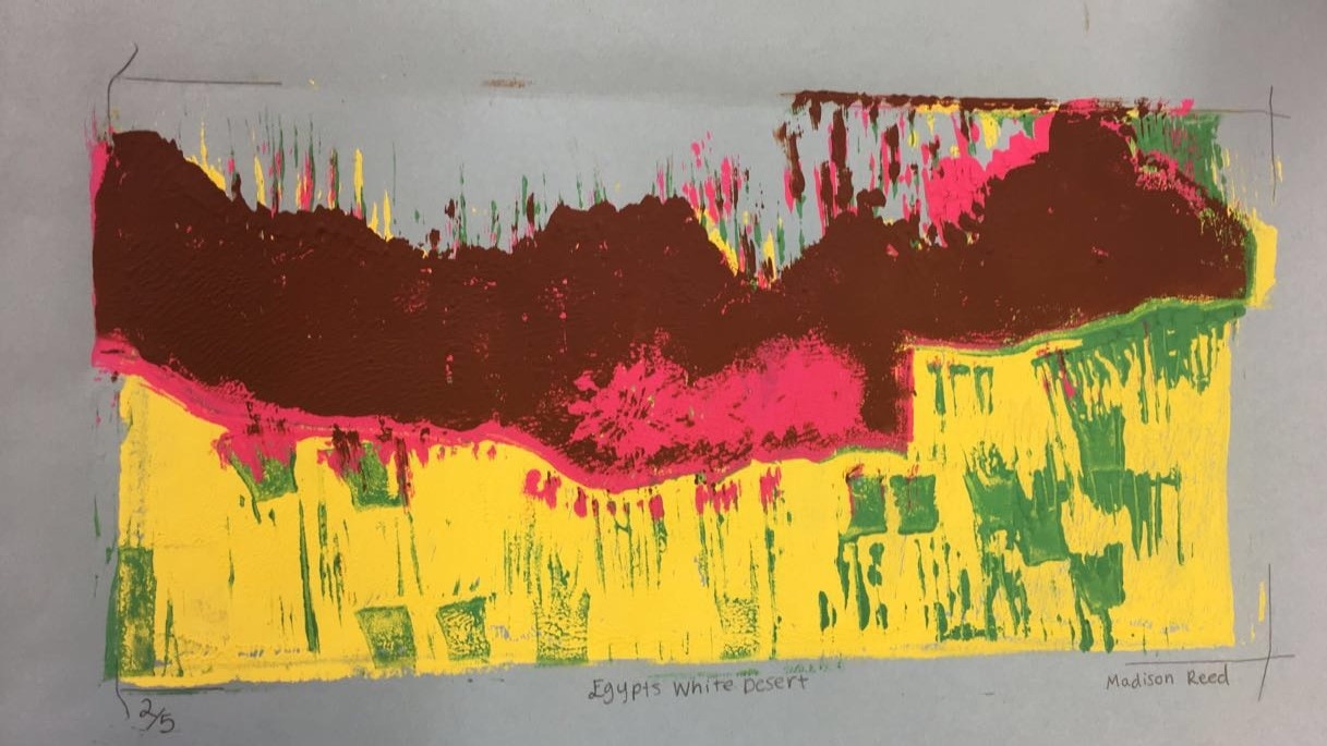
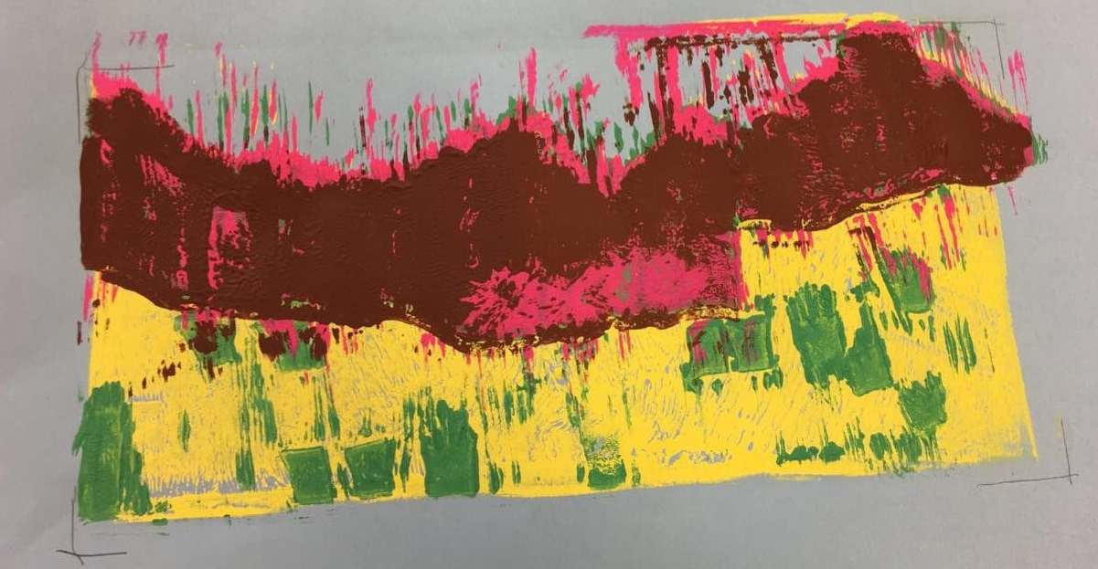
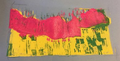
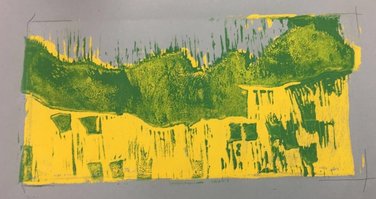
1. For my prints i think i did pretty good carving out the linoleum after each color. The two things i had trouble with was carving out the grass patches and also the flowers. As the registration or lining up goes it was pretty good for the most part. There was a couple that matched up perfectly, a couple that were a little off and one that when printed went out of the registration lines. When doing the burnishing that was no problem, it just depended on the paint. Sometimes
1. For my prints i think i did pretty good carving out the linoleum after each color. The two things i had trouble with was carving out the grass patches and also the flowers. As the registration or lining up goes it was pretty good for the most part. There was a couple that matched up perfectly, a couple that were a little off and one that when printed went out of the registration lines. When doing the burnishing that was no problem, it just depended on the paint. Sometimes
|
|
|
|
|
Clay Food Critique
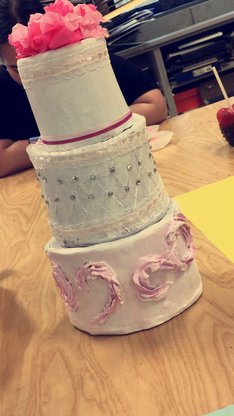
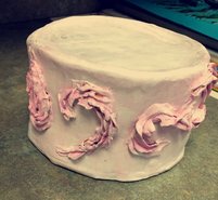
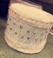
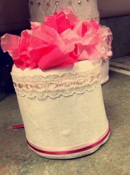
Madison Reed 1. The craftsmanship of my sculpture is decent. Once the clay came out of the Kiln it was a little cracked but still workable. I then went on to paint it and add decorations such as lace, tissue paper flowers and little silver stones. This really improved the craftsmanship of my clay cake. 2. The most difficult part of this project was sculpting the clay correctly and keeping the clay wet throughout the days that we worked on it. Also making sure the clay was thick enough and sculpted exactly how i needed it so it would come out the right way. 3. Yes, my color choices did work out harmoniously. Since i did a wedding cake i painted it white with a little pink on the bottom layer. For the decorations i also used pink lace and tissue paper. 4. I would say my sculpture looks the best from the view i have in the picture to the right. Although i do have decoration going around the whole thing, for the bottom layer i only have the "frosting" decoration around the front part of it . 5. Constructing a sculpture is more difficult than just drawing it in 2D. Drawing what you're going to sculpt is easy, just making a sketch of it but bringing it to life is a lot different. Your sculpting something in 3D with all views. 6.To create textures in my sculpture i used a needle tool on my second layer to create the lines you see and on my last layer i used a bag with wet clay to create the "frosting" type design that you see. 7.Yes, my sculpture looks like the actual food i was trying to create, cake. I accomplished this by first making my three layers of cake with clay, all different sizes and then painted them white being the frosting. Finally i added decorations and made it look like an actual wedding cake. 8. If i were to do this project again i would construct my clay cake layers better so they were more circular and i would also hope that next time i wouldn't drop one of them. But overall i'm pretty happy with how it turned out after everything was added and i was all finished with it. |
|
|
|
|
|
Landscape in the style of an artist critique-Self Evaluation
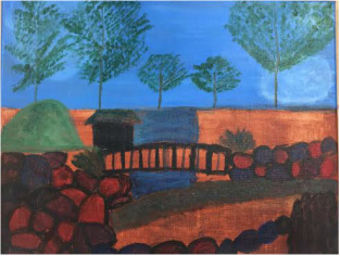
- Who was your referenced artist for the painting? Name 4 main ideas you used from your research to create your painting. My reference artist for the painting was Joan Miro. 4 Main ideas that i used from my research was 1. He primarily painted still-lives, landscapes, and genre scenes which is why i chose to paint a landscape. 2. He developed an interest in the bold, bright colors, so i used one of his portraits to chose the colors i wanted to use. 3. He painted more simple shaped things rather than in detail. 4. He has a meaning and reason for everything he draws.
- Describe the craftsmanship of your painting. (Is it neat and well executed?) The craftsmanshift of my painting is a more simple looking piece and the top half came out more neat then the bottom half.
- What was the most difficult part of this project? The most difficult part of this project was definately working with the paint and trying to get things to look the way they were suppose to.
- Describe your color choices and how they reflect the work of your chosen artist? For my colors i used a reference picture (One of his portraits) and tried to copy the same color scheme.
- Describe how the style of your landscape reflects your chosen artist. The style of my landscape reflects my artist because one of the things he primarly painted were landscapes, he used bold colors and the items in my landscape are more simple shaped.
- What do you think your chosen artist would say if he or she could see your painting today? If my chosen artist could see my painting today he would probably say that it doesnt really resemble his style and that i could have done better.
- What would you do differently if you were to do this project again? If i could do this project again i would choose a different picture/ landscape to paint and i would have someone help me practice my painting skills so i had a better knowledge.
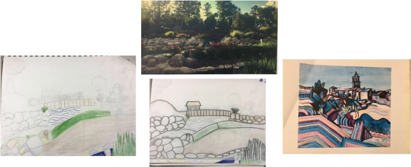
Artist Landscape Sketches and Blog: The photo on the top was my own photo that i was trying to recreate, the photo on the right was one of Joan Miro's portraits that i was using as a reference photo and the other 2 are my sketches that i drew out before actually moving over to the canvas.
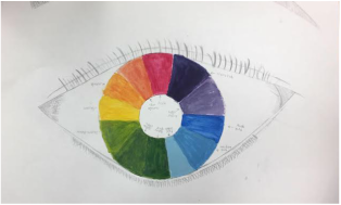
Color Wheel Blog: For my color wheel i got my idea off Pinterest I decided to draw an eye with all the different colors as the color of the actual eye ball. I used white and black paint to make lighter and darker shades of colors. I also labeled all the different colors that were painted.
|
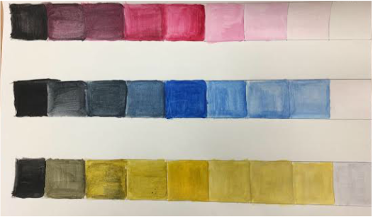
Paint Value Blog: For my paint value chart i used the three colors yellow,blue and a pinky-purple color. For each one i stared with white and got darker until the last shade which is black. We did this to show different values and shades of differnet hues.
O'Keeffe Inspired Final
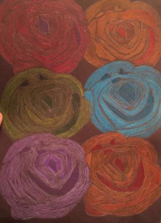
1. In my drawing i like how all the roses are the same shape and size but have different colors. I also like how they are blended.
2.For each flower i used three different shades of colors including a base color, a darker highlighting color and also a lighter blended color to show values.
3. Georgia O'Keeffe draws a lot of flowers so as a rose being my favorite flower i decided to draw multiple of them.
4. For each one of my roses i chose one main color i wanted to color it (using this as the base color). I then found a lighter and darker shade of that color.
5. I used contrast by again my three different shades of color on each rose.
6. I used dark shades to show the highlighted parts of each rose.
7. The difficulty i had with this piece was transferring each rose over nicely with the tracing paper (Keeping the bold/ distinctive lines). The color went over pretty well except on the blue one I pressed down to hardly and colored over it to many times.
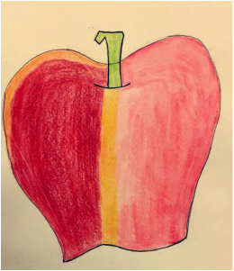
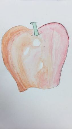
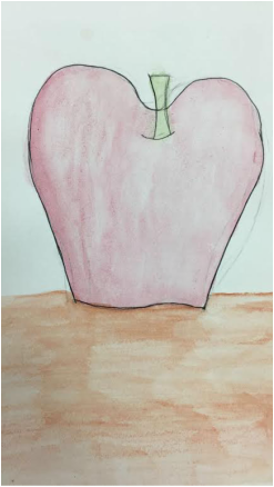
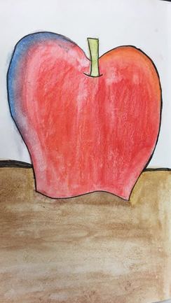
For the watercolor apples we used both watercolor and watercolor pencils. We also used pen and regular colored pencils to add some details to them. They include highlights and a surface that they are said to be "sitting on".
|
|
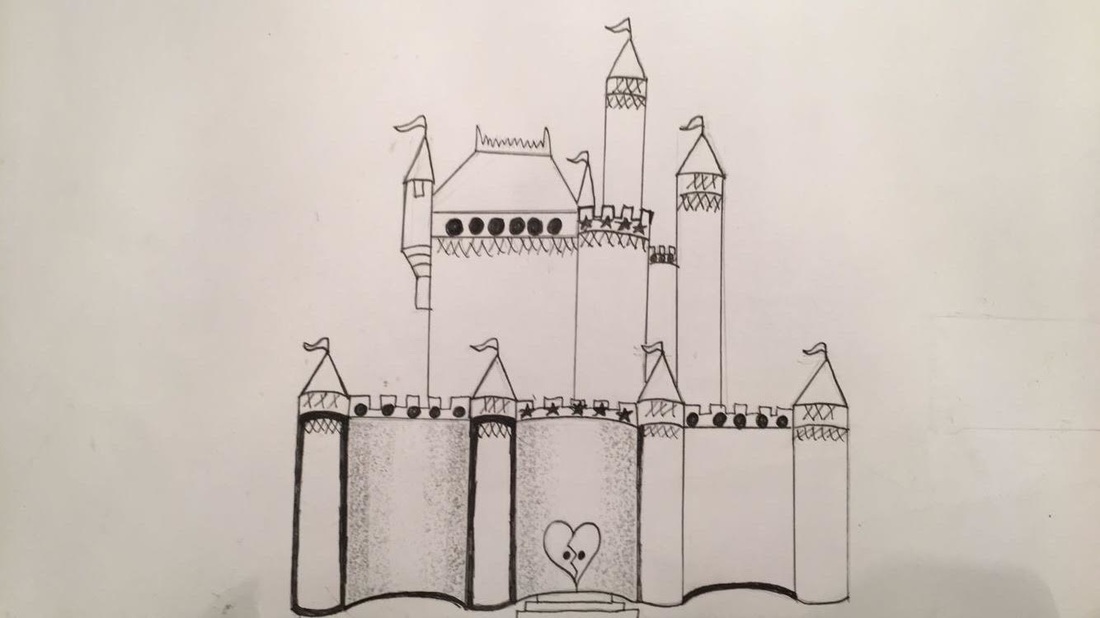
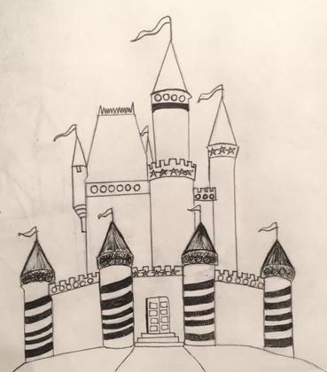
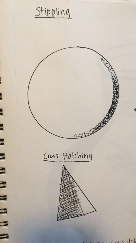
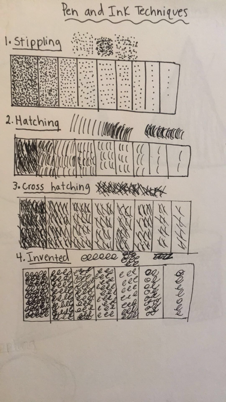
1. For my pen and ink techniques i used cross hatching and stippling. Stippling helped to show value ( darker to lighter values).
2. I used perspective in the bottom of my drawing to show the way the castle was positioned. Perspective is important because it makes your drawings look more realistic.
3.Texture in your composition shows you certain detailing.
4.Value is so important in this project because it shows contrast and shadows.
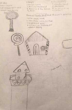
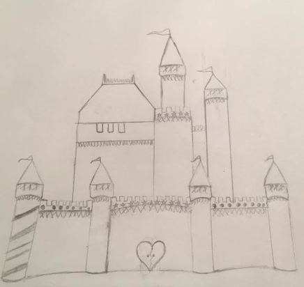
5.I decided to do a castle for my fairy tale drawing and i made a lot of different sketches for it but wish my final piece had came out better.
6.If i could re-create this drawing i would add more stippling and add more detailing to make it more interesting and nice looking.
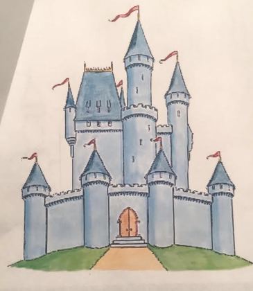
7. I just decided to draw a castle. I used a reference picture and made it up as i went with different detailing/decorations.
8. It is important to understand the techniques taught in class so you can properly execute them on drawings.
9. The things I have learned will help me know different ways of approaching projects we have.
2. I used perspective in the bottom of my drawing to show the way the castle was positioned. Perspective is important because it makes your drawings look more realistic.
3.Texture in your composition shows you certain detailing.
4.Value is so important in this project because it shows contrast and shadows.
5.I decided to do a castle for my fairy tale drawing and i made a lot of different sketches for it but wish my final piece had came out better.
6.If i could re-create this drawing i would add more stippling and add more detailing to make it more interesting and nice looking.
7. I just decided to draw a castle. I used a reference picture and made it up as i went with different detailing/decorations.
8. It is important to understand the techniques taught in class so you can properly execute them on drawings.
9. The things I have learned will help me know different ways of approaching projects we have.
|
|
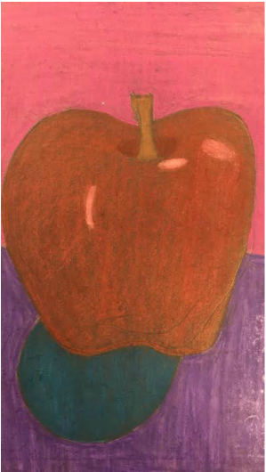
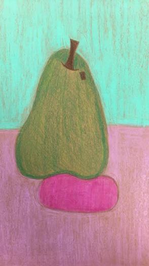
For my color pencil fruits i showed value and used a shadow. I also used layers of color and blended them together with a background.
|
|
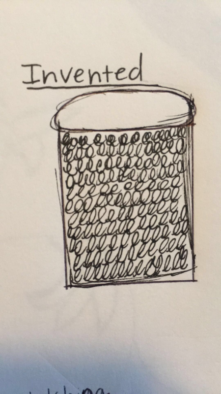
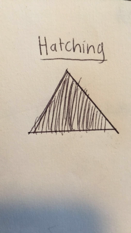
For the Pen and Ink Techniques we used value charts to show different values of each different technique(Stippling,Hatching,Cross-Hatching, and Invented). We also drew different shapes to show how you would apply the technique to each one.
Perspective Assignments
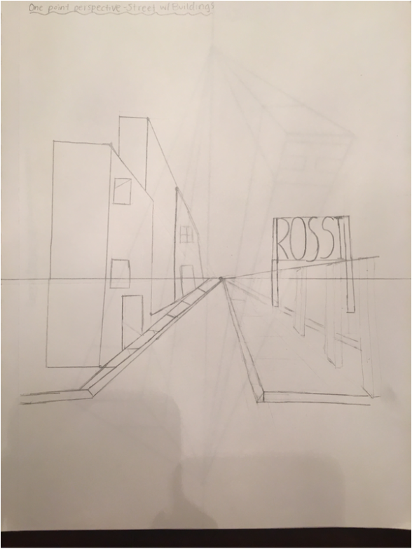
When doing our one point perspective we first drew the horizon line and our one point. We then began drawing buildings with doors and windows. Finally we drew the side walk on both sides, a picket fence and a billboard.
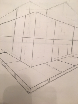
First, we drew our horizon line with two perspective points. We then began to construct our buildings on a corner view, making sure everything is connected to a point. We then finally drew the sidewalk also on a corner view.
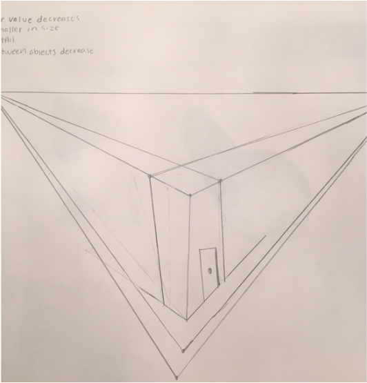
For our three point perspective practice we started off with our horizon line like always with two perspective points on it and another right in the middle on the bottom. Everything was connected from the three points and we created a building. This created a more 3D effect.
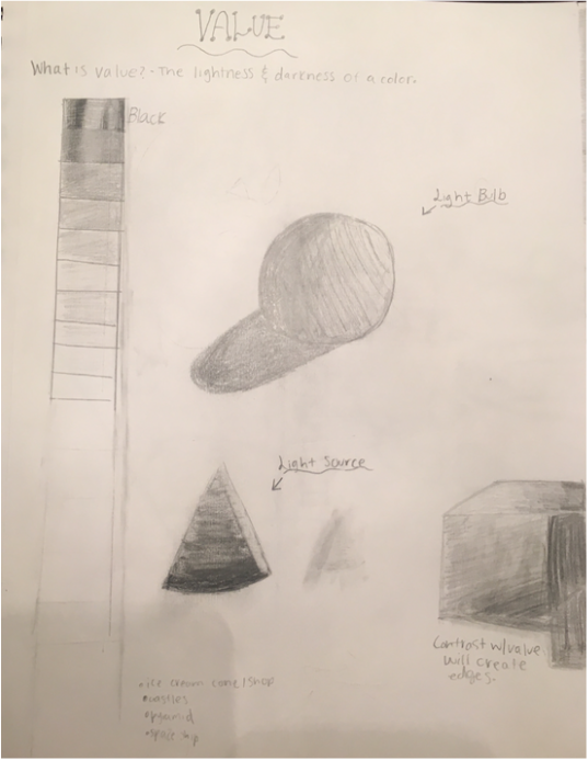
What is value? Well value is the lightness and darkness of a color. Here we used our drawing pencils to shade in different shapes. We also used a value chart to practice shading.
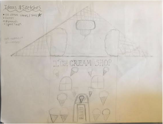
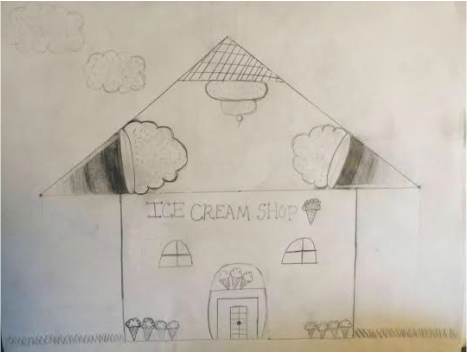
Our assignment was to come up with different ideas using one 3D shape 15 different times in a sketch. After looking over all my ideas i thought that using cones to create an ice cream shop would be pretty cool. Using these cones i not only incorporated them into the roof but i also used them as decoration throughout specific places on my ice cream shop. I also included some clouds with sprinkles on them.
|
|
